Fonts: The Forensic and the Forward-Looking
First, the forensic.
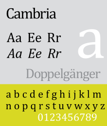
In Re McGoey, 2019 ONSC 80, a bankrupt argued that two properties had been placed in trust for his children in 1995 and were not part of the assets available to his creditors in 2018.
The trustee in bankruptcy produced an expert in design and typography, who testified that the fonts of the purported trust deeds (Cambria and Calibri, respectively) were developed by Microsoft in 2002 and not released to the public until 2007. No one in 1995 could have used them.
On the strength of that evidence, the judge concluded that the trusts were a sham, and fraudulent preferences intended to defeat creditors.
On a more positive note, lawyers should think about fonts in their own documents – obviously not in order to deceive, but rather to make their written work easier to read and more compelling.
Guidance can be found in Matthew Butterick’s Typography for Lawyers: Essential Tools for Polished and Persuasive Documents, 2d ed. (Houston, Tex.: O’Connor’s, 2015). My copy of the first edition was a gift from the late Simon Fodden, Slaw’s founder.
Some fonts are more readable on a screen than on a printed page, and vice versa. Others are better suited to contracts than presentations. Some fonts look professional, others (Comic Sans) do not.
Butterick hates Arial; and, while ‘it’s not that Times New Roman is a bad font’, he doesn’t exactly love it (the United States Supreme Court forbids it).
The book also discusses punctuation marks, spacing, formatting and lay-out, with elegant sample documents and practical advice.
Start the discussion!